Trending Window Colours for 2026: From Pantone Cloud Dancer to Matte Anthracite – What to Choose and Why
The colour of your windows is a decision you'll live with for the next twenty or thirty years. It cannot be changed as easily as the paint on a wall. That is precisely why it pays to understand where architecture is heading – not to blindly follow every trend, but to make an informed choice that will not look dated after just two seasons. 2026 brings a clear signal on this front. The Pantone Color Institute has chosen white as its Colour of the Year for the first time in over 25 years of announcements. The shade Cloud Dancer (PANTONE 11-4201) is not a sterile, clinical white. It is a warm, soft and "airy" tone that fundamentally shifts the way we think about light-coloured window frames. At the same time, matte anthracite, deep black and realistic wood-effect finishes continue to dominate contemporary architecture. How do these trends translate into specific profile systems and RAL colour codes available in our range? Which surface technologies should you choose to ensure the colour lasts for decades? And how do you match your frame colour to your façade for a cohesive result? You will find all the answers below – grounded in the technical parameters of GEALAN, Yawal and Aliplast systems, which we have worked with for over 30 years.
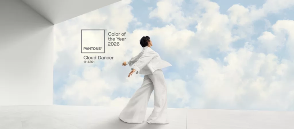
Cloud Dancer – Pantone Colour of the Year 2026 and Its Impact on the Window Industry
Pantone Cloud Dancer (11-4201) is a warm, off-white shade with a subtle, well-balanced tension between cool and warm undertones. Leatrice Eiseman, Executive Director of the Pantone Color Institute, describes it as “a whisper of calm and peace in a noisy world.” In an age of visual overload and information fatigue, people are increasingly seeking stillness – including in the spaces they inhabit.
For architecture, Cloud Dancer signals a return to light, matte window frames – but in an entirely new context. This is not the bland technical white found in standard developer brochures. It is a deliberate aesthetic choice rooted in the warm minimalism and Japandi movements, where white frames visually expand glazed areas, blur the boundary between interior and exterior, and create a neutral backdrop for natural materials such as raw timber, stone and brushed metal.
Translating Cloud Dancer into Window Profiles – RAL Equivalents
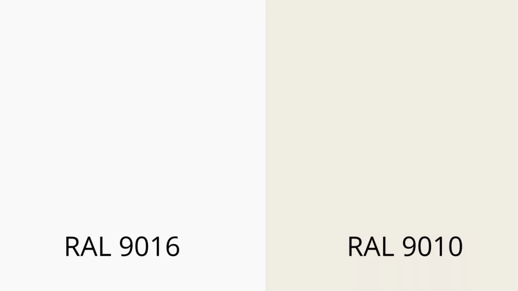
It must be said clearly: Pantone and RAL are two separate colour systems. There is no official, authorised Cloud Dancer equivalent in the RAL palette. Any transition between the two systems is an approximation that requires comparing physical colour samples. That said, spectral analysis points to two RAL shades that come closest to the intent of Pantone’s choice:
RAL 9010 (Pure White) – a slightly warmer, off-white tone that, in a deep matte finish, shows the highest visual correlation with Cloud Dancer. This shade best captures the soft, non-reflective character of the Colour of the Year.
RAL 9016 (Traffic White) – a slightly cooler, greyish-white tone widely used across the window industry. Marginally more neutral than Cloud Dancer, but a strong alternative in a matte finish.
The key to achieving the Cloud Dancer effect on a window profile lies not in the shade alone, but in the matte finish. A glossy white will never convey the calm, “airy” character of this colour. It is the finish – satin, matte, or subtly textured – that determines the final impression.
The Six Most Important Window Colour Trends for 2026
Cloud Dancer is an important signal, but the architecture of 2026 offers a considerably broader palette. Based on the directions presented at BAU Munich and Fensterbau Frontale Nuremberg, as well as our own sales experience across European markets, we identify six key colour directions.
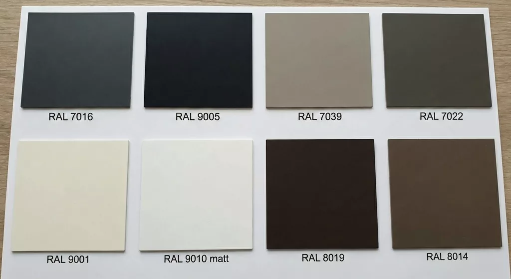
Matte anthracite (RAL 7016) remains the undisputed choice for modern window joinery. In 2026, however, it is evolving towards ultra-matte and textured finishes that replicate anodised aluminium. This anthracite loses any plasticky character and gains a refinement that architects designing clean, minimalist buildings expect.
Deep matte black (RAL 9005) is the absolute favourite for “modern barn” projects and urban loft conversions. Black frames create a graphic outline that emphasises the transparency of large glass panels. In practice, a textured finish is advisable to minimise the visibility of fingerprints and minor surface scratches.
Warm greys and taupe (RAL 7039, RAL 7022) are gaining ground as a bridge between the austerity of modern architecture and the desire for domestic warmth. Greyish-beige umbra (RAL 7022) or quartz grey (RAL 7039) pair beautifully with light render and exposed concrete façade elements, creating subtler contrasts than pure black.
Authentic wood-effect finishes are experiencing a renaissance – but in an entirely new quality. Winchester Oak, Turner Oak and Golden Oak are returning in versions with synchronised grain embossing at a reduced gloss level, visually and tactilely almost indistinguishable from real timber. Light wood tones integrate perfectly with Scandinavian and Japandi aesthetics.
Off-whites and cream shades – the direct echo of Cloud Dancer in window joinery. Matte cream-white (RAL 9001 or RAL 9010 matt) makes a building appear larger, introduces a sense of cleanliness and works equally well on classic country homes and contemporary minimalist projects.
Chocolate and muted brown tones (RAL 8019, RAL 8014) represent the new face of brown. Tobacco and coffee-coloured shades, far removed from traditional “dark wood,” find their place in premium residential projects and resonate beautifully with timber cladding and natural stone façade finishes.
Poland, Germany, Austria – Shared Trends and Regional Differences
Having served three markets for over 30 years, we observe both common tendencies and distinct regional preferences.
In Poland, particularly in Silesia and the single-family housing sector in the south of the country, clients show strong interest in wood-effect finishes (Winchester Oak, Golden Oak) for their versatility and their ability to add visual warmth to any building form. At the same time, demand for deep matte black and anthracite for contemporary projects is growing rapidly. The relationship between aesthetics and value remains a primary consideration.
In Germany and Austria, colour decisions are inseparably linked to sustainability and technical performance. “Bauhaus charm” trends call for extremely slim, near-invisible frames. Significant emphasis is placed on profiles made from recycled PVC and the highest acoustic insulation ratings. Surface coatings must meet rigorous quality standards – which is why certifications such as Qualicoat and Qualanod are treated not as marketing claims but as firm purchasing requirements. Warm, off-white tones in the spirit of Cloud Dancer are particularly popular here, as they harmonise with the prevailing aesthetic of natural materials and sustainable design.
A common thread across all three markets is the growing popularity of bicolour solutions – a dark exterior colour matched to the façade and a bright white or subtle wood effect on the interior side to maximise natural light. This pragmatic approach reconciles façade coherence with indoor comfort.
How to Match Window Colour to Your Façade – A Practical Guide
Architects apply the 60/30/10 rule: 60% is the background (render, brick, cladding), 30% comprises mid-scale elements (roof, window frames), and 10% covers accent details (entrance doors, lighting, guttering). Even without an architect, you can apply this principle to your own project.
Light façade + dark frames (anthracite RAL 7016, black RAL 9005) – the classic contemporary contrast. The strong graphic frame outline emphasises the scale of the glazed areas and gives the building a bold, defined character. The most versatile combination for modern single-family homes.
Light façade + warm-toned frames (Cloud Dancer, greige, off-white) – the “quiet luxury” effect. The gentle transition between frame and render creates a sense of cohesion and calm. Ideal for suburban villas, passive houses and Scandinavian-influenced projects.
Dark or timber-clad façade + light window frames – the inverted contrast, which prevents the building from feeling visually heavy. Light frames brighten the façade and add lightness, which is especially important when dealing with large areas of engineering brick or dark timber cladding.
Timber façade + wood-tone or warm grey frames – the “total look” or a subtle tone-on-tone contrast. The key is matching colour temperature: warm wood on the exterior calls for a warm frame tone, not a cool grey.
The Technology Behind the Colour: What Determines Decades of Durability?
Most articles on trending window colours stop at inspiration. Competitors claim that “matte windows don’t fade” – but never explain why. Yet it is precisely the coating technology – not the colour itself – that determines whether a shade lasts 10 or 30 years in an unchanged state.
PVC Profiles: GEALAN-acrylcolor® Technology
The GEALAN S9000 and S8000 systems feature the unique GEALAN-acrylcolor® technology. This is not an ordinary decorative film or paint. It is a 0.5 mm layer of coloured acrylic glass (PMMA) fused inseparably to the PVC profile during co-extrusion.
What does this mean in practice? The acrylcolor® surface is twice as hard as standard PVC. It is completely resistant to peeling, chipping and scratching. Rigorous testing to international standards demonstrates a virtually imperceptible colour shift (ΔE<2) even after 10 years of intense UV exposure. This means the anthracite, black or warm grey on your windows retains its depth of colour for decades – with no repainting and no restoration required.
The acrylcolor® palette covers all key 2026 trend colours: RAL 7016 (anthracite), RAL 9005 (jet black), RAL 7039 (quartz grey), RAL 7022 (umbra) and DB703. Beyond these, over 50 colour variants are available across both GEALAN systems, including films from the Realwood® collection with authentic grain structure (Golden Oak, Walnut, Mahogany) and a bicolour option. For those seeking a Cloud Dancer equivalent in PVC, GEALAN offers matte smooth films in RAL 9010 (Pure White matt) and the classic RAL 9016 – a perfect foundation for warm minimalist architecture.
Aluminium Profiles: Yawal and Aliplast Systems
In aluminium windows and doors, colour durability is provided by powder coating and anodising – technologies that offer even greater colour freedom than PVC profiles.
The Yawal TM 77N system (77 mm frame depth, Uw from 0.66 W/(m²K), security up to RC4) supports painting in any colour from the full RAL Classic palette. Profiles are powder-coated to the Qualicoat Seaside standard – meaning advanced surface preparation processes that guarantee excellent corrosion resistance even in environments with high chloride and sulphur oxide concentrations. Available finishes include smooth, matte and textured variants, as well as wood-effect coatings.
Aliplast systems (Ecofutural, Superial 800, Steel Look) stand out for one of the most comprehensive finish ranges available on the market. In addition to the full RAL palette with Qualicoat certification (licence 1518), they offer:
Aliplast Wood Colour Effect – 18 natural wood shades applied by thermal transfer, backed by Qualideco certification (PL-0001) guaranteeing fade resistance. Aliplast Loft View – raw, industrial finishes that replicate concrete and Corten-weathering steel. A direct response to the growing loft aesthetic trend in architecture for 2026. Anodised finishes with Qualanod certification (licence 1808) – refined metallic surfaces with exceptional weather resistance.
PVC or Aluminium – Colour Differences Worth Knowing
Choosing between PVC and aluminium is not only a matter of budget and thermal performance. From a colour perspective, both materials have their strengths.
PVC profiles (GEALAN S9000, S8000) offer the best value for money in terms of surface quality. The acrylcolor® technology delivers a surface comparable in durability to powder-coated aluminium, at a lower entry price. The Realwood® wood-effect films are virtually indistinguishable from the real material. The limitation is a slightly narrower range of non-standard colours – though all key 2026 trend shades are available within the standard offer.
Aluminium profiles (Yawal, Aliplast) provide complete freedom: any colour from the RAL palette, textured finishes, anodising, concrete and rust-effect imitations (Loft View), and even metallic lacquering. Aluminium is the material of choice for large-format constructions (HST sliding systems, curtain walling) and projects requiring custom shades. Qualicoat Seaside and Qualanod certifications provide additional long-term assurance.
The solution that bridges both worlds is the bicolour option – available in both GEALAN and aluminium systems. Dark anthracite outside and warm white inside? Oak effect on the façade and smooth white in the living room? These combinations are not only on-trend but have a practical rationale: a lighter interior frame reflects light and makes the room feel larger.
Do Trending Window Colours Cost More?
Standard white PVC windows are the baseline price point. Choosing a colour involves a premium, the size of which depends on the technology and material selected.
For PVC profiles, a single-sided colour film (e.g. anthracite RAL 7016 on the exterior) adds approximately 20% to the price of a white window. A double-sided film or bicolour option increases the price by around 40%. Exclusive acrylcolor® finishes and Realwood® décors may carry a slightly higher price, but their durability and scratch resistance more than offset the difference over time.
For aluminium, standard colours (popular RAL shades from the manufacturer’s palette) typically carry no significant premium. Non-standard colours, textured finishes, anodised surfaces and Wood Colour Effect décors generate a higher cost, but simultaneously offer durability and aesthetics unavailable in other technologies.
It is worth noting that window colour does not directly affect eligibility for energy efficiency grants or rebates. The key criterion remains the thermal transmittance value Uw – both white and coloured windows meeting current energy efficiency standards (Uw ≤ 0.9 W/(m²K), or the equivalent threshold under applicable national or regional energy codes) qualify for financial support where programmes exist.
FAQ – Your Most Common Questions About Window Colours in 2026
Are white windows going out of fashion? Quite the opposite. Pantone selecting Cloud Dancer as Colour of the Year 2026 is a clear signal that white is making a comeback – but in a new form. Rather than sterile, high-gloss white, architects are choosing matte, warm off-white tones (RAL 9010 matt, RAL 9001) that convey calm and understated luxury.
How long does the colour last on PVC and aluminium windows? It depends on the technology. The GEALAN-acrylcolor® coating (PMMA, 0.5 mm) shows a colour shift of just ΔE<2 after 10 years of UV exposure – imperceptible to the naked eye. Powder-coated aluminium profiles to the Qualicoat standard retain colour and gloss for decades, with manufacturer warranties on coatings ranging from 10 to 25 years depending on the supplier.
Which window colours are the most expensive? Standard white PVC profiles are the most affordable. A single-sided colour film adds approximately +20%, while double-sided adds around +40%. For aluminium, the most popular RAL colours (e.g. 7016, 9005) are typically included in the standard price. The most expensive options are special effects – wood-effect finishes (Wood Colour Effect), anodising and non-standard custom colours.
Do dark windows heat the interior more than white ones? The frame profile represents only a small percentage of the total window area. The influence of frame colour on room temperature is marginal compared to the properties of the glazing unit. Far more significant factors are the type of glass (solar control, selective low-e) and external shading solutions such as external roller shutters or venetian blinds.
What window colour works best for a modern barn house? Modern barn-style homes are dominated by matte black (RAL 9005) or deep anthracite (RAL 7016) – particularly on large fixed glazing and HST sliding door systems. Black creates a graphic outline that contrasts with a light, smooth façade. The bicolour option (black exterior, white interior) is effectively the standard choice for this architectural style.
Summary – Key Considerations Before You Invest in 2026
Choosing a window colour is a decision where aesthetics meets technology. Before you commit, keep a few points in mind.
Choose a matte or textured finish – regardless of colour. Matte has defined the look of 2026 architecture and will still feel current in five years’ time. Ask about coating certifications, not just general “durability” claims. Qualicoat Seaside, Qualideco, Qualanod – these are specific, verifiable standards. Consider the bicolour option. It offers a flexibility that single-colour windows simply cannot match: a dark exterior shade suited to your façade, and a lighter interior finish to keep your rooms bright.